class: center, middle, inverse, title-slide .title[ # Marine Community Ecology 2024 ] .subtitle[ ## 03-Data visualization with ggplot2 ] .author[ ### Simon J. Brandl ] .institute[ ### The University of Texas at Austin ] .date[ ### 2024/01/01 (updated: 2024-02-04) ] --- background-image: url("images/Priolepis.png") background-size: cover class: center, top # Plotting data using ggplot2 <style type="text/css"> .scrollable { height: 300px; overflow-y: auto; } .scrollable-auto { height: 75%; overflow-y: auto; } .remark-slide-scaler { overflow-y: auto; } </style> --- # The ggplot package 🎨 .pull-left[ - stands for 'Grammar of Graphics' - offers an extremely versatile set of functions to create beautiful data visualizations - works with layers: data, aesthetics, geoms, axes, descriptions ] .pull-right[ <img src="images/ggplot2.png" width="75%" /> ] --- ## The basic concept <img src="images/ggplot-layers.png" width="100%" /> --- ## The ggplot2 package 📦 .pull-left[ - the core package for tidy data processing is the **ggplot2** package - there are many auxiliary packages that include specialized geoms, functions, etc., such as **ggridges**, **GGally**, or **ggeffects** - other packages integrate with ggplot such as **patchwork** or **fishualize** 😍 ] .pull-right[ .center[ .top[ <img src="images/fishualize_logo.png" width="40%" /> ]]] ```r #install.packages("ggplot2", repos = "http://cran.us.r-project.org") #install.packages("ggridges", repos = "http://cran.us.r-project.org") #install.packages("fishualize", repos = "http://cran.us.r-project.org") #install.packages("patchwork", repos = "http://cran.us.r-project.org") library(ggplot2) library(tidyverse) ``` ``` ## ── Attaching core tidyverse packages ──────────────────────── tidyverse 2.0.0 ── ## ✔ dplyr 1.1.4 ✔ readr 2.1.4 ## ✔ forcats 1.0.0 ✔ stringr 1.5.1 ## ✔ lubridate 1.9.3 ✔ tibble 3.2.1 ## ✔ purrr 1.0.2 ✔ tidyr 1.3.0 ## ── Conflicts ────────────────────────────────────────── tidyverse_conflicts() ── ## ✖ dplyr::filter() masks stats::filter() ## ✖ dplyr::lag() masks stats::lag() ## ℹ Use the conflicted package (<http://conflicted.r-lib.org/>) to force all conflicts to become errors ``` ```r library(patchwork) library(fishualize) library(ggridges) ``` --- ## Preparation Let's read in datasets to use with our ggplot exploration ```r herbivore.traits <- read.csv(file = "data/coralreefherbivores.csv") head(herbivore.traits) ``` ``` ## family genus species gen.spe sl ## 1 Acanthuridae Acanthurus achilles Acanthurus.achilles 163.6667 ## 2 Acanthuridae Acanthurus albipectoralis Acanthurus.albipectoralis 212.7300 ## 3 Acanthuridae Acanthurus auranticavus Acanthurus.auranticavus 216.0000 ## 4 Acanthuridae Acanthurus blochii Acanthurus.blochii 82.9000 ## 5 Acanthuridae Acanthurus dussumieri Acanthurus.dussumieri 193.7033 ## 6 Acanthuridae Acanthurus fowleri Acanthurus.fowleri 266.0000 ## bodydepth snoutlength eyediameter size schooling ## 1 0.5543625 0.4877797 0.3507191 S Solitary ## 2 0.4405350 0.4402623 0.2560593 M SmallGroups ## 3 0.4726556 0.5386490 0.2451253 M MediumGroups ## 4 0.5586486 0.4782217 0.3196155 M SmallGroups ## 5 0.5457248 0.5661867 0.2807218 L Solitary ## 6 0.4669521 0.5950563 0.2217376 M Solitary ``` ```r reef.fish <- read.csv(file = "data/reef_fishes.csv") head(reef.fish) ``` ``` ## family genspe genus species year ## 1 Acanthuridae Acanthurus.tristis Acanthurus tristis 1993 ## 2 Acanthuridae Acanthurus.blochii Acanthurus blochii 1835 ## 3 Acanthuridae Acanthurus.xanthopterus Acanthurus xanthopterus 1835 ## 4 Acanthuridae Acanthurus.chirurgus Acanthurus chirurgus 1787 ## 5 Acanthuridae Ctenochaetus.truncatus Ctenochaetus truncatus 2001 ## 6 Acanthuridae Acanthurus.dussumieri Acanthurus dussumieri 1835 ## habitat depth length category ## 1 reef-associated 30 25 No_crypto ## 2 reef-associated 15 45 No_crypto ## 3 reef-associated 100 70 No_crypto ## 4 reef-associated 25 39 No_crypto ## 5 reef-associated 21 16 No_crypto ## 6 reef-associated 131 54 No_crypto ``` --- class: center, middle, inverse # Getting started --- ## The <span style="color:orange">ggplot()</span> function .pull-left[ - the <span style="color:orange">ggplot()</span> function will create your base layer - you can think of this as a blank canvas - not very exciting, but it's a start ```r p1 <- ggplot() ``` ] .pull-right[ .center[ <!-- --> ]] --- ## Adding data 📈 .pull-left[ - you can add data using the 'data()' argument - this doesn't actually change anything in how the plot looks, but it directs the function to the dataset to use for all other arguments ```r # use the herbivore.traits dataset p1 <- ggplot(data = herbivore.traits) ``` ] .pull-right[ .center[ <!-- --> ]] --- ## Specifying aesthetics using aes() .pull-left[ - aesthetics in ggplot (specified with the aes() argument) clarify which columns hold the information and how you want to use it - let's say we want to look at the relationship between herbivore body depth (x) and eye diameter (y) - as you can see, we now get axes on our graph that reflect our variables of interest ```r p1 <- ggplot(data = herbivore.traits, aes(x = bodydepth, y = eyediameter)) ``` ] .pull-right[ .center[ <!-- --> ]] --- ## Adding geoms: scatterplots .pull-left[ - with the blank canvas, the source data, and the aesthetics in place, we can actually show the patterns in the data - since we're interested in a relationship between two continuous variables, we will use a scatterplot with geom_point() - we can add and modify geoms by using **+** after each line ```r p1 <- ggplot(data = herbivore.traits, aes(x = bodydepth, y = eyediameter)) + geom_point() ``` - not exactly a work of art, but informative no less 😎 ] .pull-right[ .center[ <!-- --> ]] --- ## Adjusting visual elements .pull-left[ - we can easily modify the size, shape, and color of the plotted points ```r # size changes size of the point # shape changes the shape of the point # color changes the color of the point p1 <- ggplot(data = herbivore.traits, aes(x = bodydepth, y = eyediameter)) + geom_point(size = 5, shape = 18, color = "blue") ``` ] .pull-right[ .center[ <!-- --> ]] --- ## Mapping groups onto geoms .pull-left[ - it's often useful to use colors, shapes, or sizes to display group membership - we can map groups onto geoms, but need to use the aes() mapping function - this can be done either in the main aes() mapping or for each specific geom ```r p1 <- ggplot(data = herbivore.traits, aes(x = bodydepth, y = eyediameter, # group membership assigned here color = family)) + geom_point(size = 5, shape = 18) # no color argument here ``` ] .pull-right[ .center[ <!-- --> ]] --- ## Multiple group aesthetics .pull-left[ - we can use shapes, sizes, colors, or fills to indicate different group memberships ```r p1 <- ggplot(data = herbivore.traits, aes(x = bodydepth, y = eyediameter, color = family, # added shape = size shape = size)) + geom_point(size = 5) # removed shape argument here ``` ] .pull-right[ .center[ <!-- --> ]] --- ## Continuous group aesthetics .pull-left[ - we can include a third continuous variable on the plot - including more information isn't always better: this is a very busy plot ```r p1 <- ggplot(data = herbivore.traits, aes(x = bodydepth, y = eyediameter, color = family, shape = size, # including sl as a continuous variable size = sl)) + geom_point() ``` ] .pull-right[ .center[ <!-- --> ]] --- ## Facets .pull-left[ - if there is too much information for one panel, we can tell ggplot to create multiple panels - this is done using the facet_grid() or facet_wrap() argument ```r p1 <- ggplot(data = herbivore.traits, aes(x = bodydepth, y = eyediameter, color = family, shape = size, size = sl)) + geom_point() + facet_wrap(. ~ family) ``` ] .pull-right[ .center[ <!-- --> ]] --- class: center, middle <img src="images/honest_work.jpeg" width="75%" /> --- class: inverse, center, top # Exercise 3.1 🏋️♀️ ## Read in your coralreefherbivores.csv file and perform the following: ### a) Create a scatterplot with ggplot2 where x = 'sl' and y = 'bodydepth' ### b) Change the points to be black triangles (shape = 17) with size 4 ### c) Change the color of the points to reflect different genera ### d) Break up the graph into panels based on sizeclasses --- class: center, top # Solution 3.1a 🤓 .pull-left[ ```r p2 <- ggplot(data = herbivore.traits, aes(x = sl, y = bodydepth)) + geom_point() ``` ] .pull-right[ .center[ <!-- --> ]] --- class: center, top # Solution 3.1b 🤓 .pull-left[ ```r p2 <- ggplot(data = herbivore.traits, aes(x = sl, y = bodydepth)) + geom_point(shape = 17, size = 4) ``` ] .pull-right[ .center[ 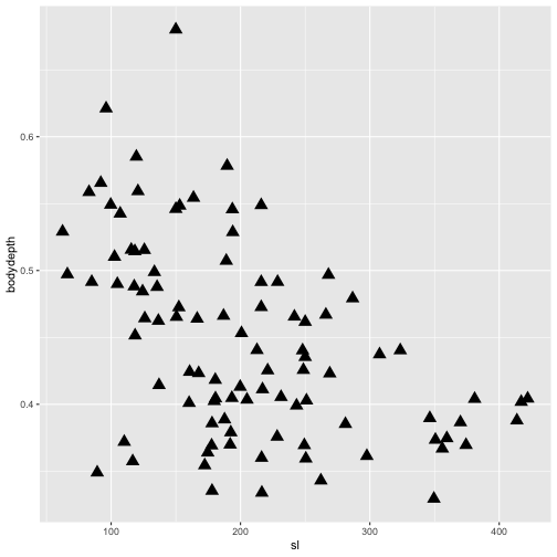<!-- --> ]] --- class: center, top # Solution 3.1c 🤓 .pull-left[ ```r p2 <- ggplot(data = herbivore.traits, aes(x = sl, y = bodydepth, color = genus)) + geom_point(shape = 17, size = 4) ``` ] .pull-right[ .center[ 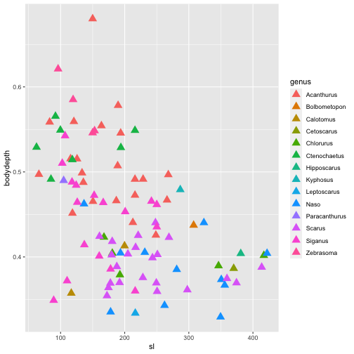<!-- --> ]] --- class: center, top # Solution 3.1d 🤓 .pull-left[ ```r p2 <- ggplot(data = herbivore.traits, aes(x = sl, y = bodydepth, color = genus)) + geom_point(shape = 17, size = 4) + facet_wrap(.~size) ``` ] .pull-right[ .center[ 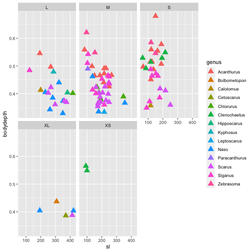<!-- --> ]] --- class: center, middle, inverse # Summarizing data 📊 --- ## Data within groups .pull-left[ - let's re-investigate the plot we made earlier - if we focus on the y-axis, we see that that there may be a difference in eye diameter among the four families <img src="images/threeherbs.jpg" width="100%" /> ] .pull-right[ .center[ <!-- --> ]] --- ## Categorical axes .pull-left[ - we can get a better sense for differences among groups by including a categorical axis - this is very simple: you just need to specify a categorical column in aes() ```r p3 <- ggplot(data = herbivore.traits, aes(x = family, y = eyediameter, color = family)) + geom_point() ``` - it's not the best way of visualizing it ] .pull-right[ .center[ 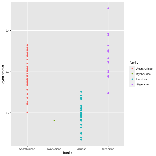<!-- --> ]] --- ## Jittering points .pull-left[ - one way of making the plot clearer is by slightly adjusting ('jittering') each point - this can be achieved using geom_jitter() instead of geom_point() 🐞 ```r p3 <- ggplot(data = herbivore.traits, aes(x = family, y = eyediameter, color = family)) + geom_jitter(width = 0.1) # specify the width you want to use ``` ] .pull-right[ .center[ 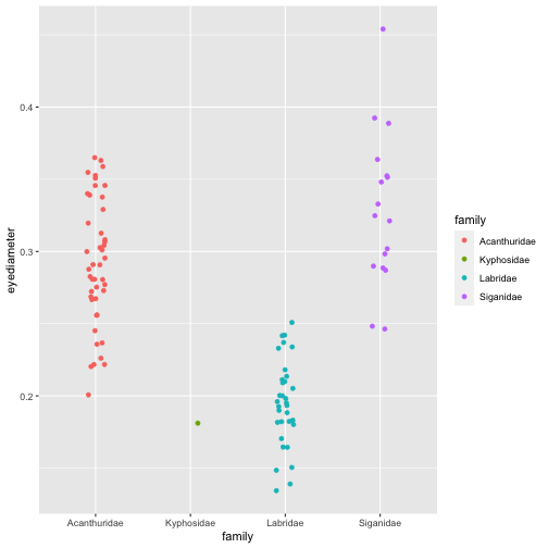<!-- --> ]] --- ## Boxplots .pull-left[ - while jittering makes it easier to see, it is much better to visualize actual distributions in the four families - the easiest way of accomplishing this is with a boxplot 📊 ```r p3 <- ggplot(data = herbivore.traits, aes(x = family, y = eyediameter, color = family)) + geom_boxplot() ``` - by default, ggplots boxplots display the **median**, **1st and 3rd quartiles**, **1.5x the interquartile range**, and **outliers** ] .pull-right[ .center[ 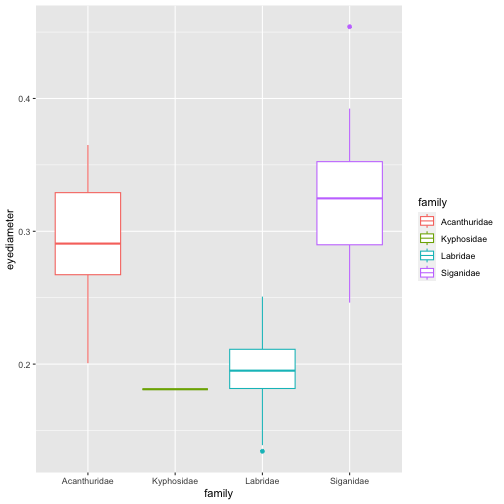<!-- --> ]] --- ## Filling boxes .pull-left[ - the fill of the boxes is set to white by default - we can use the 'fill' argument to change that ```r p3 <- ggplot(data = herbivore.traits, aes(x = family, y = eyediameter, fill = family)) + geom_boxplot(color = "black", notch = TRUE) # notch = TRUE creates a notch ;-) ``` ] .pull-right[ .center[ 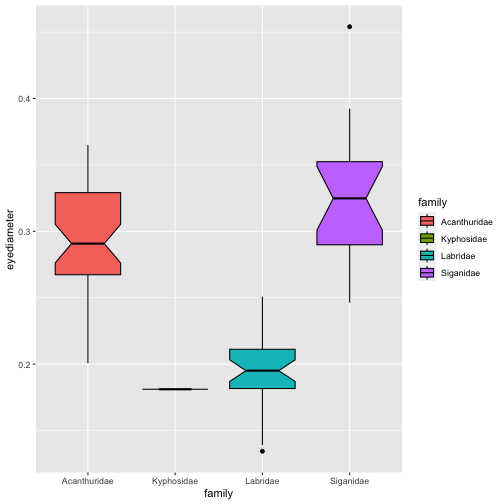<!-- --> ]] --- ## Violin plots 🎻 .pull-left[ - instead of boxplots, we can also show the entire distribution with a violin plot - we can easily specify the quantiles we want ```r p3 <- ggplot(data = herbivore.traits, aes(x = family, y = eyediameter, fill = family)) + geom_violin(draw_quantiles = c(0.05, 0.5, 0.95)) ``` - since violins can't be made from a single data point, we are losing the Kyphosidae ] .pull-right[ .center[ 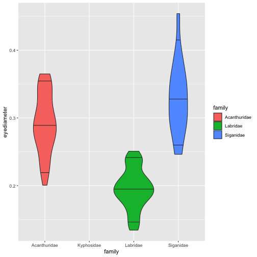<!-- --> ]] --- ## Overlaying multiple geoms .pull-left[ - it is often useful to combine multiple geoms - a distribution and its raw data together is called a 'sina plot' ```r p3 <- ggplot(data = herbivore.traits, aes(x = family, y = eyediameter, fill = family)) + geom_violin(draw_quantiles = c(0.05, 0.5, 0.95)) + geom_jitter(width = 0.1) ``` ] .pull-right[ .center[ <!-- --> ]] --- ## Density ridges .pull-left[ - we can also display data as density curves, called ridges - to do so, it's nice to change the x- and y-axis configuration - it's also nice to adjust the transparency, which is done using the 'alpha' argument ```r p3 <- ggplot(data = herbivore.traits, aes(x = eyediameter, y = family, fill = family)) + geom_density_ridges(alpha = 0.75) + geom_jitter(height = 0.1) # note that we changed the jitter from width to height ``` ] .pull-right[ .center[ ``` ## Picking joint bandwidth of 0.0174 ``` <!-- --> ]] --- ## Other distributional geoms 👻 - there are many other ways to plot distributions, including geoms such as <span style="color:orange">geom_histogram()</span>, <span style="color:orange">geom_density()</span>, or <span style="color:orange">geom_halfeye()</span> </b> </b> <img src="images/normal_paranormal.png" width="100%" /> --- class: inverse, center, top # Exercise 3.2 🏋️♀️ ## Using the herbivore dataset: ### a) Examine eyediameter across size classes using a violin plot, with eyediameter on the x-axis and size class on the y-axis, with quantiles set to 20%, 50%, and 80% ### b) Fill the violins with colors based on size class and reduce the opacity to 50% ### c) Add the raw data points, with shapes symbolizing families --- class: center, top # Solution 3.2a 🤓 .pull-left[ ```r p4 <- ggplot(data = herbivore.traits, aes(x = eyediameter, y = size)) + geom_violin(draw_quantiles = c(0.2, 0.5, 0.8)) ``` ] .pull-right[ .center[ <!-- --> ]] --- class: center, top # Solution 3.2b 🤓 .pull-left[ ```r p4 <- ggplot(data = herbivore.traits, aes(x = eyediameter, y = size, fill = size)) + geom_violin(draw_quantiles = c(0.2, 0.5, 0.8), alpha = 0.5) ``` ] .pull-right[ .center[ <!-- --> ]] --- class: center, top # Solution 3.2c 🤓 .pull-left[ ```r p4 <- ggplot(data = herbivore.traits, aes(x = eyediameter, y = size, fill = size)) + geom_violin(draw_quantiles = c(0.2, 0.5, 0.8), alpha = 0.5) + geom_point(aes(shape = family)) ``` ] .pull-right[ .center[ <!-- --> ]] --- class: center, middle, inverse # Uncertainty 🤔 --- ## Means and errors .pull-left[ - historically: barplots 🥴 - we have to do some tidy data wrangling to get our data into this format ```r herbivore.trait.means <- herbivore.traits %>% group_by(family) %>% summarize(mean.eye = mean(eyediameter), sd.eye = sd(eyediameter), n = n()) %>% mutate(se.eye = sqrt(sd.eye)/n, lower.ci = mean.eye - qt(1 - (0.05 / 2), n - 1) * se.eye, upper.ci = mean.eye + qt(1 - (0.05 / 2), n - 1) * se.eye) p5 <- ggplot(data = herbivore.trait.means, aes(x = family, y = mean.eye, fill = family)) + geom_bar(stat = "identity") # barplot ``` ] .pull-right[ .center[ <!-- --> ]] --- ## Barplots with uncertainty .pull-left[ - the previous plot was... not great 🤢 - we can improve it by adding uncertainty using the geom_errorbar() geom ```r p5 <- ggplot(data = herbivore.trait.means, aes(x = family, y = mean.eye, fill = family)) + geom_bar(stat = "identity") + geom_errorbar(aes(ymin = lower.ci, ymax = upper.ci)) ``` - better but not fantastic tbh ] .pull-right[ .center[ <!-- --> ]] --- ## Caterpillar plots .pull-left[ - caterpillar plots are a nice alternative to barplots - note that the mean is symbolized as a shape, giving you additional options to display different groups ```r p5 <- ggplot(data = herbivore.trait.means, aes(x = family, y = mean.eye, color = family, shape = family)) + geom_pointrange(aes(ymin = lower.ci, ymax = upper.ci)) ``` ] .pull-right[ .center[ <!-- --> ]] --- class: center, middle <img src="images/barplots.jpeg" width="70%" /> --- class: center, middle, inverse # Colors, shapes, and themes 🎨 🔵 ⬜ --- ## Changing colors .pull-left[ - ggplot's default colors are hideous - we can specify our own colors using scale_fill() or scale_color() - an overview of colors in R is [here](http://www.stat.columbia.edu/~tzheng/files/Rcolor.pdf) ```r p6 <- ggplot(data = herbivore.traits, aes(x = family, y = eyediameter, fill = family)) + geom_violin(draw_quantiles = c(0.05, 0.5, 0.95)) + geom_jitter(width = 0.1, color = "white", alpha = 0.8) + scale_fill_manual(values = c("steelblue", "yellowgreen", "darkorchid", "goldenrod4")) # colors specified by name ``` ] .pull-right[ .center[ <!-- --> ]] --- ## Changing shapes .pull-left[ - similar to colors and fills, we can specify different shapes - this is done using the scale_shape_manual() function - not all shapes take fill arguments - an overview of shapes in R is [here](https://www.datanovia.com/en/blog/ggplot-point-shapes-best-tips/) ```r p6 <- ggplot(data = herbivore.traits, aes(x = family, y = eyediameter, fill = family, shape = family)) + geom_violin(draw_quantiles = c(0.05, 0.5, 0.95)) + geom_jitter(color = "black", size = 3) + scale_fill_manual(values = c("steelblue", "yellowgreen", "darkorchid", "goldenrod4")) + scale_shape_manual(values = c(21:24)) ``` ] .pull-right[ .center[ 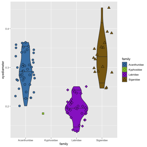<!-- --> ]] --- ## Using color palettes .pull-left[ - palettes provide predefined color scales - often important to specify whether you want discrete or continuous values - example: viridis color palette ```r p6 <- ggplot(data = herbivore.traits, aes(x = family, y = eyediameter, fill = family, shape = family)) + geom_violin(draw_quantiles = c(0.05, 0.5, 0.95)) + geom_jitter(color = "black", size = 3) + scale_fill_viridis_d()+ scale_shape_manual(values = c(21:24)) ``` ] .pull-right[ .center[ 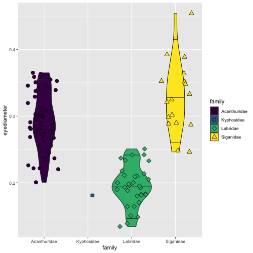<!-- --> ]] --- ## Fishualize 😍 .pull-left[ - the [fishualize](https://nschiett.github.io/fishualize/articles/overview_colors.html) package provides color palettes based on fish colors ```r p6 <- ggplot(data = herbivore.traits, aes(x = family, y = eyediameter, fill = family, shape = family)) + geom_violin(draw_quantiles = c(0.05, 0.5, 0.95)) + geom_jitter(color = "black", size = 3) + scale_fill_fish_d(option = "Centropyge_loricula")+ scale_shape_manual(values = c(21:24)) ``` <img src="images/fishualize_logo.png" width="30%" /> ] .pull-right[ .center[ 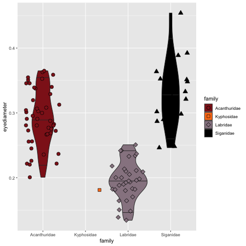<!-- --> ]] --- ## Continuous color palettes .pull-left[ ```r p6 <- ggplot(data = herbivore.traits, aes(x = bodydepth, y = eyediameter, fill = sl, shape = family)) + geom_jitter(color = "black", size = 3) + scale_fill_fish(option = "Trimma_lantana")+ scale_shape_manual(values = c(21:24)) ``` <img src="images/Tlantana.png" width="80%" /> ] .pull-right[ .center[ 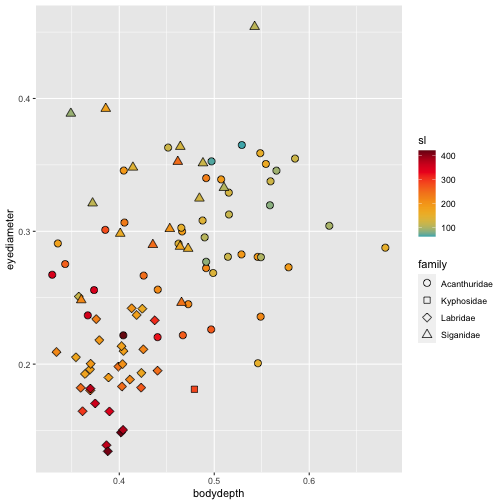<!-- --> ]] --- ## Themes .pull-left[ - use theme wrapper to modify the color of the background - **theme_bw()** - dark on light background, good for presentations - **theme_classic()** - includes x and y axis lines, but no gridlines - **theme_minimal()** - no background annotations ```r p6 <- ggplot(data = herbivore.traits, aes(x = bodydepth, y = eyediameter, fill = sl, shape = family)) + geom_jitter(color = "black", size = 3) + scale_fill_fish(option = "Trimma_lantana")+ scale_shape_manual(values = c(21:24)) + theme_classic() ``` ] .pull-right[ .center[ 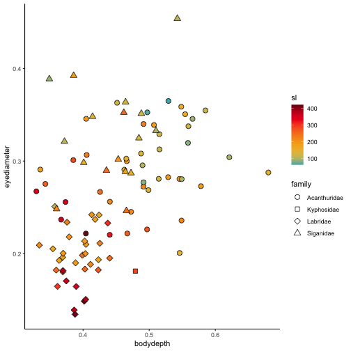<!-- --> ]] --- class: center, middle, inverse # Scales and labels 📏 --- ## Preparation .pull-left[ - sometimes it's useful to rescale your axes - to explore this, we will use the reef.fish() dataset - coral reef fishes: year of description, depth range, size, and whether they're considered a cryptobenthic or mobile reef fish. ``` ## family genspe genus species year ## 1 Acanthuridae Acanthurus.tristis Acanthurus tristis 1993 ## 2 Acanthuridae Acanthurus.blochii Acanthurus blochii 1835 ## 3 Acanthuridae Acanthurus.xanthopterus Acanthurus xanthopterus 1835 ## 4 Acanthuridae Acanthurus.chirurgus Acanthurus chirurgus 1787 ## 5 Acanthuridae Ctenochaetus.truncatus Ctenochaetus truncatus 2001 ## 6 Acanthuridae Acanthurus.dussumieri Acanthurus dussumieri 1835 ## habitat depth length category ## 1 reef-associated 30 25 No_crypto ## 2 reef-associated 15 45 No_crypto ## 3 reef-associated 100 70 No_crypto ## 4 reef-associated 25 39 No_crypto ## 5 reef-associated 21 16 No_crypto ## 6 reef-associated 131 54 No_crypto ``` ] --- ## Rescaling .pull-left[ - plot the relationship between year of description and body size - body size, abundance, biomass, or species richness are often poorly distributed ```r p7 <- ggplot(reef.fish, aes(x = year, y = length)) + geom_point() ``` ## 🤮 ] .pull-right[ .center[ 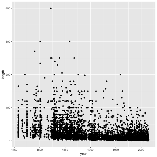<!-- --> ]] --- ## Using the log-scale .pull-left[ - the log-scale is a useful transformation when data are exponentially distributed - two options: transform first or in plot - there's no log() of 'NA', so we have to remove NAs first ```r reef.fish.na <- reef.fish %>% drop_na(length) p7 <- ggplot(reef.fish, aes(x = year, y = length)) + geom_point() + scale_y_log10() ``` ] .pull-right[ .center[ 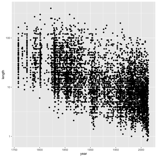<!-- --> ]] --- ## Axis breaks and limits .pull-left[ - we can control the ticks and labels - let's flip the axes to make it more visually appealing ```r p7 <- ggplot(reef.fish, aes(x = length, y = year)) + geom_point() + scale_x_log10() + scale_y_continuous(limits = c(1755, 2015), breaks = seq(1755, 2015, 20)) + annotation_logticks(sides = "b") ``` ] .pull-right[ .center[ 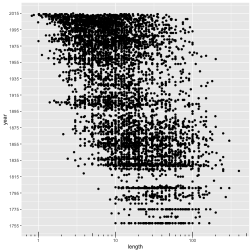<!-- --> ]] --- ## Labeling .pull-left[ - easy to change the axis labels - xlab() and ylab() for simple relabeling ```r p7 <- ggplot(reef.fish, aes(x = length, y = year)) + geom_point(color = "steelblue") + theme_classic() + scale_x_log10() + scale_y_continuous(limits = c(1755, 2015), breaks = seq(1755, 2015, 20)) + annotation_logticks(sides = "b") + xlab("Body length (cm)") + ylab("Year of description") ``` ] .pull-right[ .center[ <!-- --> ]] --- ## Legends .pull-left[ - we can also manipulate the legend for grouping variables ```r p7 <- ggplot(reef.fish, aes(x = length, y = year, color = category)) + geom_point() + theme_classic() + scale_x_log10() + scale_y_continuous(limits = c(1755, 2015), breaks = seq(1755, 2015, 20)) + annotation_logticks(sides = "b") + xlab("Body length (cm)") + ylab("Year of description") + scale_color_fish_d(option = "Trimma_lantana", name = "Fish category", labels = c("Cryptobenthic", "Mobile")) ``` ] .pull-right[ .center[ <!-- --> ]] --- class: center, middle, inverse # Combining multiple plots ➕ --- ## Patchwork .pull-left[ - the **patchwork** package let's you combine plots ```r p8 <- p6 / p7 + plot_annotation(tag_levels = 'a') ``` ] .pull-right[ .center[ <!-- --> ]] --- --- class: inverse, center, top # Exercise 3.3 🏋️♀️ ## Using the reef fish dataset: ### a) Create a boxplot with family on the y-axis and length on the x-axis, with the x-axis log-scaled ### b) Fill the boxes based on 'category' using the _Hypsypops rubicundus_ color palette from the fishualize package ### c) Change it to theme_bw() rename the axis labels to "Reef fish family" and "Length (cm)" --- class: center, top # Solution 3.3a 🤓 .pull-left[ ```r p9 <- ggplot(data = reef.fish, aes(x = length, y = family)) + geom_boxplot() + scale_x_log10() ``` ] .pull-right[ .center[ ``` ## Warning: Removed 561 rows containing non-finite values (`stat_boxplot()`). ``` <!-- --> ]] --- class: center, top # Solution 3.3b 🤓 .pull-left[ ```r p9 <- ggplot(data = reef.fish, aes(x = length, y = family, fill = category)) + geom_boxplot() + scale_x_log10() + scale_fill_fish_d(option = "Hypsypops_rubicundus") ``` ] .pull-right[ .center[ ``` ## Warning: Removed 561 rows containing non-finite values (`stat_boxplot()`). ``` <!-- --> ]] --- class: center, top # Solution 3.3c 🤓 .pull-left[ ```r p9 <- ggplot(data = reef.fish, aes(x = length, y = family, fill = category)) + geom_boxplot() + scale_x_log10() + scale_fill_fish_d(option = "Hypsypops_rubicundus") + theme_bw() + xlab("Length (cm)") + ylab("Reef fish family") ``` ] .pull-right[ .center[ ``` ## Warning: Removed 561 rows containing non-finite values (`stat_boxplot()`). ``` <!-- --> ]] --- background-image: url("images/ggplot_meme.jpeg") background-size: cover class: center, top, inverseclass: inverse, center, top --- class: center, middle # The end