a. 3: Demo
b. 3: Slides
You can access the full slideshow used in the 3-ggplot narration here.
The dataset called ‘coralreefherbivores.csv’ can be downloaded here.
The dataset called ‘reef_fishes.csv’ can be downloaded here.
The dataset called ‘fish_abundance.csv’ can be downloaded here.
The dataset called ‘site_info.csv’ can be downloaded here.
c. 3: Exercises
Start by loading in the two datasets below (which are available for download using the links above).
Re-familiarize with the “fish_abundance.csv” dataset. The dataset includes many fish species, which were counted across different sites and depths. Fish diversity often decreases with depth on coral reefs, so let’s explore whether there is a relationship between depth and diversity.
Part I
- Simplify the dataset to include species, site, depth.
- Use distinct() to make sure no species were recorded twice.
- Calculate species richness by site and depth.
Part II
- Plot depth versus species richness.
- Add site as a color variable.
Part III
- Produce another plot, only including the families Serranidae, Acanthuridae, Pomacentridae, and Chaetodontidae.
- Use with facet_wrap() or facet_grid() to create separate facets for each family.
Part IV
- Explore differences in the species richness of the four families (Serranidae, Acanthuridae, Pomacentridae, and Chaetodontidae) using violin or density plots
- Color the density plots based on family and include the raw data to create sina plots
- Try to sort the violin plot in descending order, starting with the highest species richness
- Make it pretty! 😊
Part V
In the last plot from Exercise 1, it appears as though some sites have higher species richness than others. Let’s further examine why species richness across sites using “site_info.csv,” which includes metadata on the exposure of each site.
- Create a dataset that summarizes species richness by surveyid and site.
- Join this species richness data with the site exposure metadata.
Part VI
- Use a violin plot to visualize the species richness of exposed vs. lagoon sites.
Part VII
- Calculate the average abundance of each family in a given survey.
- Plot the average abundance using density curves.
- Bonus: Transform the x-axis to make the plot more useful.
d. 3: Solutions
Part I
- Simplify the dataset to include species, site, depth.
- Use distinct() to make sure no species were recorded twice.
- Calculate species richness by site and depth.
fish.abundance <- read.csv(file = "data/fish_abundance.csv") # load data

fish.sprich <- fish.abundance %>%
  select(site, depth, genspe) %>%
  distinct() %>%
  group_by(site, depth) %>%
  summarize(sprich = n())

fish.sprich2 <- fish.abundance %>%
  select(site, depth, genspe) %>%
  group_by(site, depth) %>%
  summarize(sprich = n_distinct(genspe))


head(fish.sprich)
# A tibble: 6 × 3
# Groups: site [2]
site depth sprich
<chr> <dbl> <int>
1 Bird Islets 2.5 107
2 Bird Islets 3 117
3 Bird Islets 3.1 64
4 Bird Islets 10 40
5 Blue Hole 2 68
6 Blue Hole 3.5 71Part II
- Plot depth versus species richness.
- Add site as a color variable.
fish.sprich.plot <- ggplot(data = fish.sprich, aes(x = depth, y = sprich, color = site)) +
  geom_point() +
  scale_color_fish_d(option = "Synchiropus_splendidus") +
  theme_bw()

fish.sprich.plot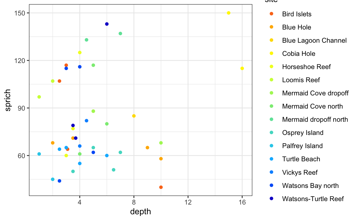
Part III
- Produce another plot, only including the families Serranidae, Acanthuridae, Pomacentridae, and Chaetodontidae.
- Use with facet_wrap() or facet_grid() to create separate facets for each family.
fish.sprich.fam <- fish.abundance %>%
  filter(family %in% c("Acanthuridae", "Chaetodontidae", "Serranidae", "Pomacentridae")) %>%
  select(site, depth, family, genspe) %>%
  distinct() %>%
  group_by(site, depth, family) %>%
  summarize(sprich = n())
head(fish.sprich.fam)
# A tibble: 6 × 4
# Groups: site, depth [2]
site depth family sprich
<chr> <dbl> <chr> <int>
1 Bird Islets 2.5 Acanthuridae 9
2 Bird Islets 2.5 Chaetodontidae 6
3 Bird Islets 2.5 Pomacentridae 29
4 Bird Islets 2.5 Serranidae 2
5 Bird Islets 3 Acanthuridae 5
6 Bird Islets 3 Chaetodontidae 9fish.sprich.fam.plot <- ggplot(fish.sprich.fam, aes(x = depth, y = sprich, color = site)) +
geom_point() +
facet_wrap(.~family, scales = "free_y") +
scale_color_fish_d(option = "Synchiropus_splendidus") +
theme_bw()
fish.sprich.fam.plot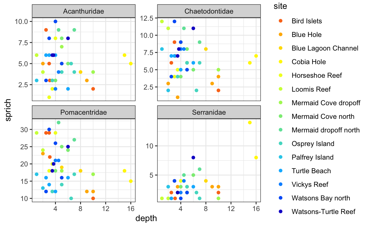
Part IV
- Explore differences in the species richness of the four families (Serranidae, Acanthuridae, Pomacentridae, and Chaetodontidae) using violin or density plots
- Color the density plots based on family and include the raw data to create sina plots
- Try to sort the violin plot in descending order, starting with the highest species richness
- Make it pretty! 😊
fish.family.plot <- ggplot(fish.sprich.fam, aes(x = fct_reorder(family, -sprich, .fun = mean),
                                                y = sprich, fill = family)) +
  geom_violin(draw_quantiles = c(0.05, 0.5, 0.95), color = "grey23", alpha = 0.8, lwd = 0.5) +
  geom_jitter(aes(shape = family), alpha = 0.5, color = "black", size = 3, width = 0.2) +
  theme_bw() +
  scale_fill_fish_d(option = "Bodianus_rufus", name = "Fish family") +
  scale_shape_manual(values = c(21:24), name = "Fish family") +
  ylab("Number of species per site") +
  xlab("Fish family")

fish.family.plot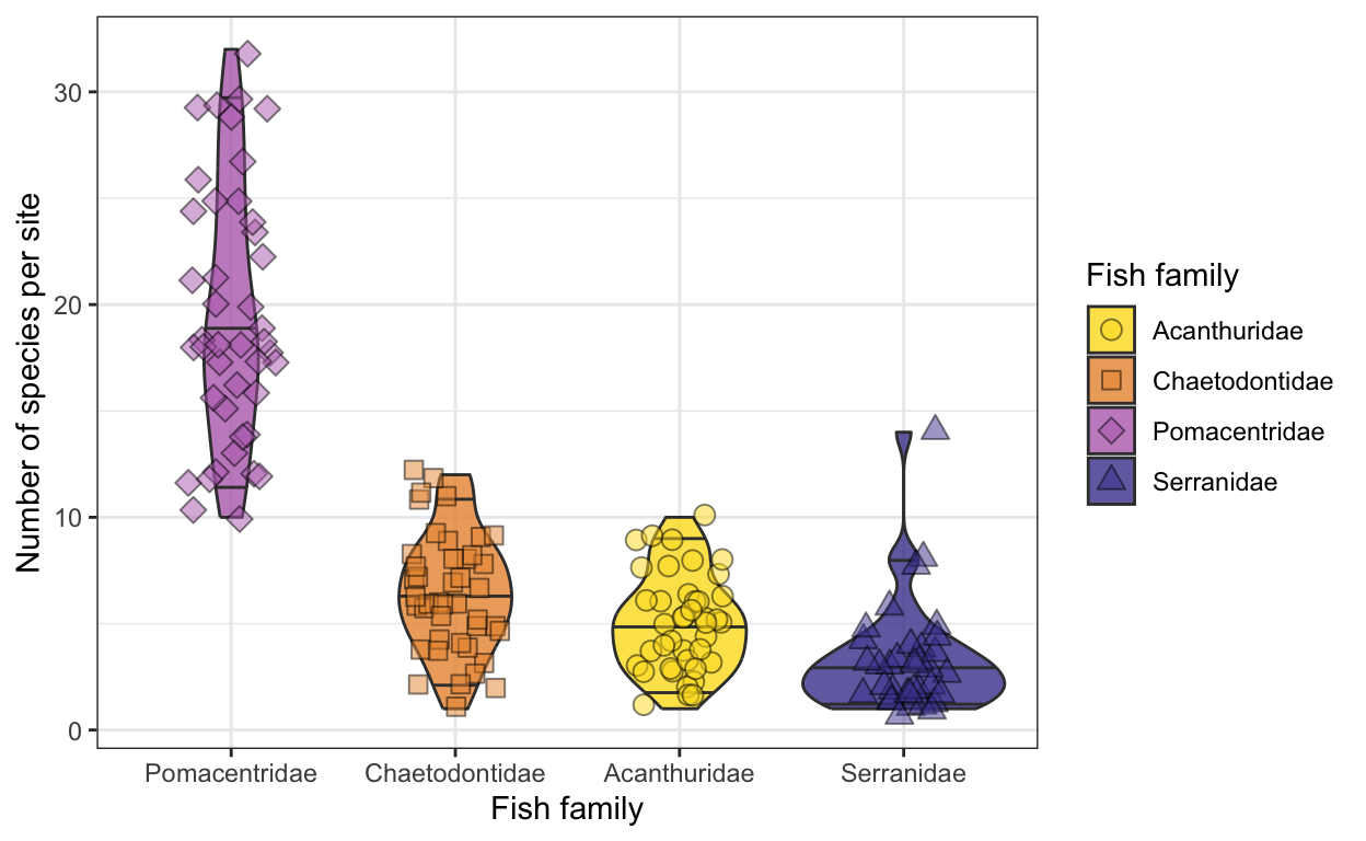
Part V
- Create a dataset that summarizes species richness by surveyid and site.
- Join this species richness data with the site exposure metadata.
site.info <- read.csv(file = "data/site_info.csv")

fish.sprich.site <- fish.abundance %>%
  select(surveyid, site, genspe) %>%
  distinct() %>%
  group_by(surveyid, site) %>%
  summarize(sprich = n()) %>%
  left_join(site.info, by = "site")

head(fish.sprich.site)
# A tibble: 6 × 4
# Groups: surveyid [6]
surveyid site sprich exposure
<int> <chr> <int> <chr>
1 4000720 Watsons Bay north 87 lagoon
2 4000721 Watsons Bay north 84 lagoon
3 4000722 Watsons-Turtle Reef 71 lagoon
4 4000723 Watsons-Turtle Reef 82 lagoon
5 4000724 Horseshoe Reef 60 lagoon
6 4000725 Horseshoe Reef 68 lagoon Part VI
- Use a violin plot to visualize the species richness of exposed vs. lagoon sites.
fish.sprich.site.plot <- ggplot(fish.sprich.site, aes(x = exposure, y = sprich, fill = exposure)) +
  geom_violin(draw_quantiles = c(0.025, 0.5, 0.975)) +
  geom_jitter(width = 0.1) +
    scale_fill_fish_d(option = "Synchiropus_splendidus") +
  theme_bw()
fish.sprich.site.plot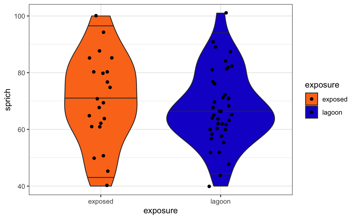
Part VII
- Calculate the average abundance of each family in a given survey (surveyid).
- Plot the average abundance using density curves.
- Bonus: transform the x-axis to make the plot more useful.
# 1) Calculate the average abundance of each family in a given survey.
fish.abun.survey <- fish.abundance %>%
  group_by(surveyid, family) %>%
  summarize(total.fish = sum(total))
head(fish.abun.survey)
# A tibble: 6 × 3
# Groups: surveyid [1]
surveyid family total.fish
<int> <chr> <int>
1 4000720 Acanthuridae 37
2 4000720 Blenniidae 9
3 4000720 Carangidae 2
4 4000720 Chaetodontidae 33
5 4000720 Gobiidae 5
6 4000720 Haemulidae 3# 2) Plot the average abundance using density curves.
fish.abun.plot <- ggplot(fish.abun.survey,
aes(x = total.fish, y = family)) +
geom_density_ridges(alpha = 0.5, fill = "forestgreen") +
theme_bw()
fish.abun.plot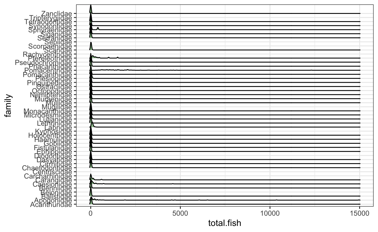
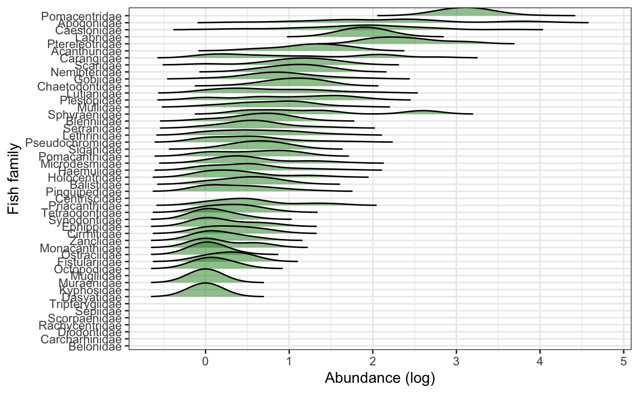
# 3) Bonus: Transform the x-axis to make the plot more useful.
# use rel_min_height() to cut the tails
fish.abun.plot2 <- ggplot(fish.abun.survey,
                        aes(x = log10(total.fish), #use log10 transformation
                            y = fct_reorder(family, total.fish, .fun = sum))) + # use fct_reorder() to reorder the y-variable as descending based on the total sum of fish in each family
                          geom_density_ridges(alpha = 0.5, rel_min_height = 0.005, fill = "forestgreen") +
  xlab("Abundance (log)") +
  ylab("Fish family") +
  theme_bw()
fish.abun.plot2