a. 4: Demo
b. 4: Slides
You can access the full slideshow used in the 4-Simulations narration here.
c. 4: Exercises
- Start by loading the tidyverse package and copy-and-pasting the basic Moran Model into your R. The code for the model is below:
library(tidyverse)

num.sims <- 20 # specify the number of simulations
num.years <- 50 # specify the number of years
freq.1.mat <- matrix(ncol = num.sims, nrow = num.years) # create a matrix for output

# FIRST LOOP FOR DIFFERENT SIMULATIONS
for (j in 1:num.sims) # use for-loop to run through the number of simulations
  {
  print(j)
  J <- 100 # 100 individuals
  t0.sp1 <- 0.5*J  # abundance of species 1 at time 0
  community <- vector(length = J) # set up community
  community[1:t0.sp1] <- 1 # specify that half of the community is species 1
  community[(t0.sp1+1):J] <- 2 # specify the other half is species 2
  year <- 2 # set 'year' to 2
  freq.1.mat[1,j] <- sum(community==1)/J # fill community matrix

  # SECOND LOOP FOR INDIVIDUAL DEATH/BIRTH
  for (i in 1:(J*(num.years-1))) # second for-loop to run multiple simulations
    {

    freq.1 <- sum(community==1)/J # freq.1 represents the frequency of species 1
    pr.1 <- freq.1 # pr.1 represents the frequency of reproduction
    community[ceiling(J*runif(1))] <- sample(c(1,2), 1, prob=c(pr.1,1-pr.1))  # birth and death rates, based on probabilities
    if (i %% J == 0)  # record data in the freq.1.mat matrix
      {

      freq.1.mat[year, j] <- sum(community==1)/J
      year <- year + 1

    }
  }
}
[1] 1
[1] 2
[1] 3
[1] 4
[1] 5
[1] 6
[1] 7
[1] 8
[1] 9
[1] 10
[1] 11
[1] 12
[1] 13
[1] 14
[1] 15
[1] 16
[1] 17
[1] 18
[1] 19
[1] 20- After that, wrangle the data as done in the lecture and produce the beautiful graph below.
colnames(freq.1.mat) <- 1:num.sims # set column names in matrix

freq.sp1.df <- as.data.frame(freq.1.mat) %>% # convert freq.1.mat into data frame
  add_column(year = 1:num.years) %>% # add a column called year
  gather(1:20, key = iteration, value = frequency) # gather into long format

p1 <- ggplot(freq.sp1.df,
             aes(x = year,
                 y = frequency,
                 group = iteration)) +
  geom_line(aes(color = frequency),
            alpha = 0.8) +
  scale_color_gradient(low = "darkorchid",
                       high = "goldenrod") +
  theme_bw() +
  theme(legend.position = "none") +
  scale_y_continuous(limits = c(0,1)) +
  xlab("Years") +
  ylab("Frequency of species 1")

p1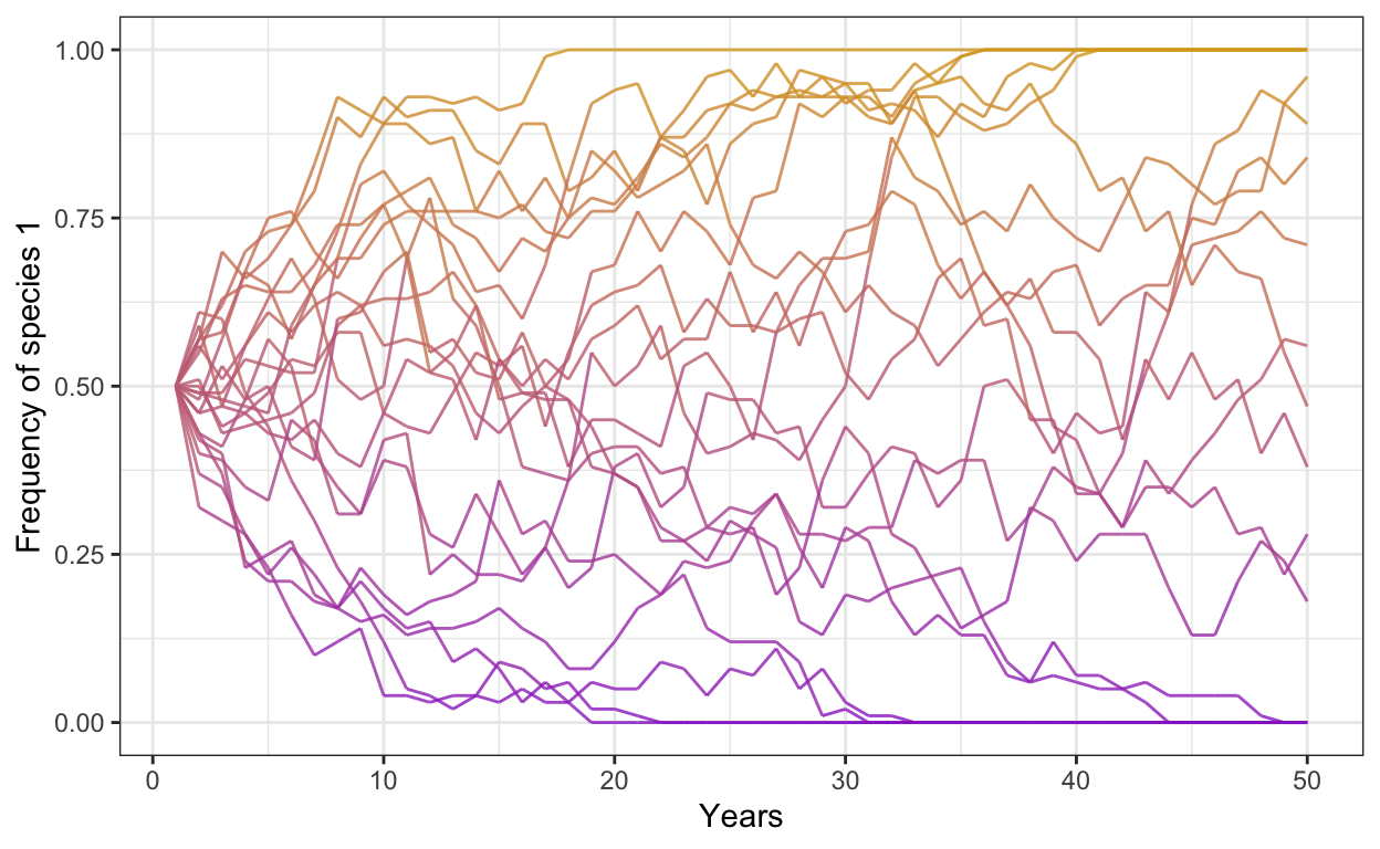
- Accomplished? Well done. Here are your exercises:
Part I:
Run the same model but change the number of individuals to 500 and increase the number of years to 75
Run the same model but decrease the number of individuals to 50, set the number of years back to 50, and increase the number of simulations to 50. Be careful with changing the number of simulations: you will have to adjust your downstream data wrangling code in the gather() function.
Change the colors of your lines to be a beautiful green and blue instead and increase the opacity to 0.9.
Part II
Introduce a selective advantage for Species 1 using a fitness ratio of 1.2. The fitness ratio affects the probability of reproduction in the following terms: fit.ratio * freq.1 / (fit.ratio * freq.1 + freq.2)
Run a model with 300 individuals, 30 simulations, 50 years, and a fitness ratio of 1.2. Plot your outcomes (and make it pretty).
Run the same model with 1000 individuals, 30 simulations, 50 years, and a fitness ratio of 1.2. Plot your outcomes next to your previous plot.
Part III
Introduce negative frequency dependence into your model. To do so, you first need to define your average fitness ratio (fit.ratio.avg) based on the prevailing selective advantage. Frequency dependence then affects the fit.ratio in the following terms: exp(freq.dep * (freq.1 - 0.5) + log(fit.ratio.avg)).
Run a model with 300 individuals, 30 simulations, 50 years, an average fitness ratio of 1.2, and a negative frequency dependence of -0.3. Plot your outcomes.
Run a model with 1000 individuals, 30 simulations, 50 years, a fitness ratio of 1.5, and a negative frequency dependence of -0.5. Plot your outcomes.
Part IV
Introduce positive frequency dependence and change your starting densities. To do so, follow the same steps as above but also adjust your initial populations.
Run a model with 1000 individuals, 30 simulations, 50 years, a fitness ratio of 1.1, and a positive frequency dependence of 0.1, with a starting frequency of Species 1 at 0.3.
Run a model with 1000 individuals, 30 simulations, 50 years, a fitness ratio of 1.0, a positive frequency dependence of 0.3, and a starting frequency of Species 1 at 0.75.
d. 4: Solutions
Part I:
- Run the same model but change the number of individuals to 500 and increase the number of years to 75
library(tidyverse)
library(patchwork)

num.sims <- 30 # specify the number of simulations
num.years <- 75 # specify the number of years
freq.1.mat <- matrix(ncol = num.sims, nrow = num.years) # create a matrix for output

# FIRST LOOP FOR DIFFERENT SIMULATIONS
for (j in 1:num.sims) # use for-loop to run through the number of simulations
  {

  J <- 500 # 500 individuals
  t0.sp1 <- 0.5*J  # abundance of species 1 at time 0
  community <- vector(length = J) # set up community
  community[1:t0.sp1] <- 1 # specify that half of the community is species 1
  community[(t0.sp1+1):J] <- 2 # specify the other half is species 2
  year <- 2 # set 'year' to 2
  freq.1.mat[1,j] <- sum(community==1)/J # fill community matrix

  # SECOND LOOP FOR INDIVIDUAL DEATH/BIRTH
  for (i in 1:(J*(num.years-1))) # second for-loop to run multiple simulations
    {

    freq.1 <- sum(community==1)/J # freq.1 represents the frequency of species 1
    pr.1 <- freq.1 # pr.1 represents the frequency of reproduction
    community[ceiling(J*runif(1))] <- sample(c(1,2), 1, prob=c(pr.1,1-pr.1))  # birth and death rates, based on probabilities
    if (i %% J == 0)  # record data in the freq.1.mat matrix
      {

      freq.1.mat[year, j] <- sum(community==1)/J
      year <- year + 1

    }
  }
}

colnames(freq.1.mat) <- 1:num.sims # set column names in matrix

freq.sp1.df <- as.data.frame(freq.1.mat) %>% # convert freq.1.mat into data frame
  add_column(year = 1:num.years) %>% # add a column called year
  gather(1:30, key = iteration, value = frequency) # gather into long format

p1 <- ggplot(freq.sp1.df,
             aes(x = year,
                 y = frequency,
                 group = iteration)) +
  geom_line(aes(color = frequency),
            alpha = 0.8) +
  scale_color_gradient(low = "darkorchid",
                       high = "goldenrod") +
  theme_bw() +
  theme(legend.position = "none") +
  scale_y_continuous(limits = c(0,1)) +
  xlab("Years") +
  ylab("Frequency of species 1")
p1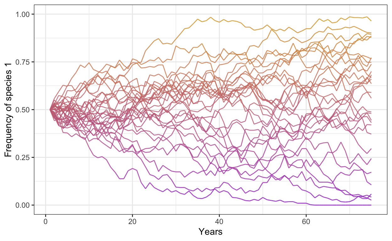
- Run the same model but decrease the number of individuals to 50, set the number of years back to 50, and increase the number of simulations to 50. Be careful with changing the number of simulations: you will have to adjust your downstream data wrangling code in the gather() function.
library(tidyverse)

num.sims <- 50 # specify the number of simulations
num.years <- 50 # specify the number of years
freq.1.mat <- matrix(ncol = num.sims, nrow = num.years) # create a matrix for output

# FIRST LOOP FOR DIFFERENT SIMULATIONS
for (j in 1:num.sims) # use for-loop to run through the number of simulations
  {

  J <- 50 # 500 individuals
  t0.sp1 <- 0.5*J  # abundance of species 1 at time 0
  community <- vector(length = J) # set up community
  community[1:t0.sp1] <- 1 # specify that half of the community is species 1
  community[(t0.sp1+1):J] <- 2 # specify the other half is species 2
  year <- 2 # set 'year' to 2
  freq.1.mat[1,j] <- sum(community==1)/J # fill community matrix

  # SECOND LOOP FOR INDIVIDUAL DEATH/BIRTH
  for (i in 1:(J*(num.years-1))) # second for-loop to run multiple simulations
    {

    freq.1 <- sum(community==1)/J # freq.1 represents the frequency of species 1
    pr.1 <- freq.1 # pr.1 represents the frequency of reproduction
    community[ceiling(J*runif(1))] <- sample(c(1,2), 1, prob=c(pr.1,1-pr.1))  # birth and death rates, based on probabilities
    if (i %% J == 0)  # record data in the freq.1.mat matrix
      {

      freq.1.mat[year, j] <- sum(community==1)/J
      year <- year + 1

    }
  }
}

colnames(freq.1.mat) <- 1:num.sims # set column names in matrix

freq.sp1.df <- as.data.frame(freq.1.mat) %>% # convert freq.1.mat into data frame
  add_column(year = 1:num.years) %>% # add a column called year
  gather(1:30, key = iteration, value = frequency) # gather into long format

p2 <- ggplot(freq.sp1.df,
             aes(x = year,
                 y = frequency,
                 group = iteration)) +
  geom_line(aes(color = frequency),
            alpha = 0.8) +
  scale_color_gradient(low = "darkorchid",
                       high = "goldenrod") +
  theme_bw() +
  theme(legend.position = "none") +
  scale_y_continuous(limits = c(0,1)) +
  xlab("Years") +
  ylab("Frequency of species 1")
p2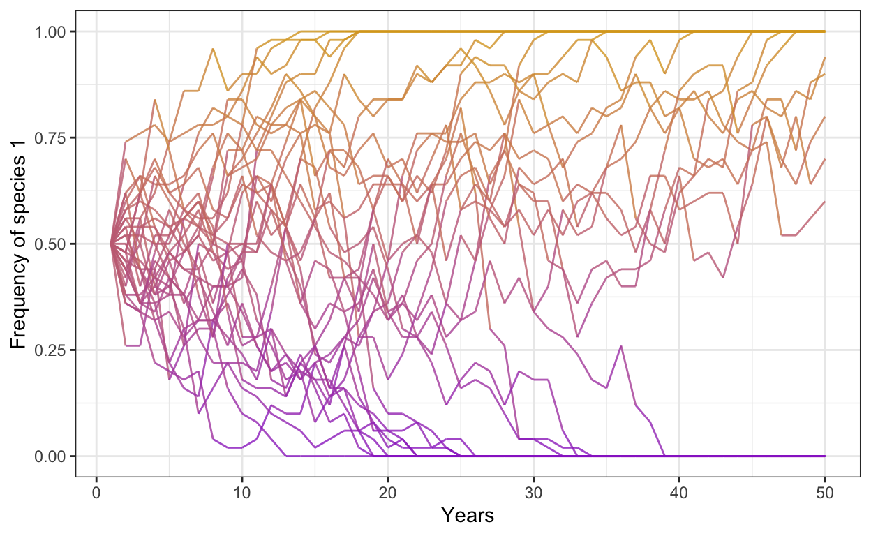
- Change the colors of your lines to be a beautiful green and blue instead and increase the opacity to 0.9.
p1 <- ggplot(freq.sp1.df,
             aes(x = year,
                 y = frequency,
                 group = iteration)) +
  geom_line(aes(color = frequency),
            alpha = 0.9) +
  scale_color_gradient(low = "forestgreen",
                       high = "steelblue") +
  theme_bw() +
  theme(legend.position = "none") +
  scale_y_continuous(limits = c(0,1)) +
  xlab("Years") +
  ylab("Frequency of species 1")
p1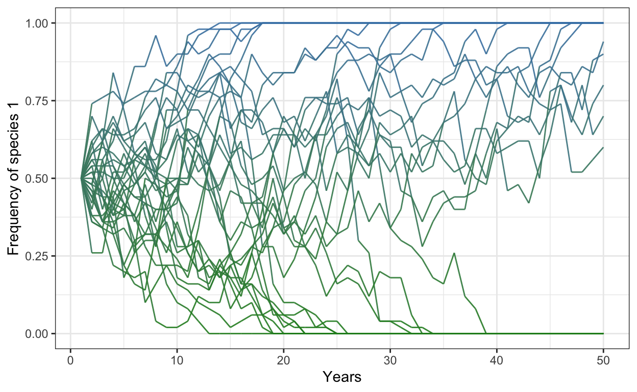
Part II
Introduce a selective advantage for Species 1 using a fitness ratio of 1.2. The fitness ratio affects the probability of reproduction in the following terms: fit.ratio * freq.1 / (fit.ratio * freq.1 + freq.2)
- Run a model with 300 individuals, 30 simulations, 50 years, and a fitness ratio of 1.2. Plot your outcomes (and make it pretty).
# selection
num.sims <- 30
num.years <- 50
freq.1.mat <- matrix(ncol = num.sims, nrow = num.years)

for (j in 1:num.sims) {
  J <- 300
  t0.sp1 <- 0.5*J
  community <- vector(length = J)
  community[1:t0.sp1] <- 1
  community[(t0.sp1+1):J] <- 2
  year <- 2
  freq.1.mat[1,j] <- sum(community==1)/J

  for (i in 1:(J*(num.years-1))) {
    freq.1 <- sum(community==1)/J
    freq.2 <- 1 - freq.1
    fit.ratio <- 1.2
    pr.1 <- fit.ratio*freq.1/(fit.ratio*freq.1 + freq.2)
    community[ceiling(J*runif(1))] <- sample(c(1,2), 1, prob=c(pr.1,1-pr.1))

    # record data in the freq.1.mat matrix
    if (i %% J == 0) {
      freq.1.mat[year, j] <- sum(community==1)/J
      year <- year + 1
    }
  }
}

colnames(freq.1.mat) <- 1:num.sims # set column names in matrix

freq.sp1.df <- as.data.frame(freq.1.mat) %>% # convert freq.1.mat into data frame
  add_column(year = 1:num.years) %>% # add a column called year
  gather(1:30, key = iteration, value = frequency) # gather into long format

p1 <- ggplot(freq.sp1.df,
             aes(x = year,
                 y = frequency,
                 group = iteration)) +
  geom_line(aes(color = frequency),
            alpha = 0.8) +
  scale_color_gradient(low = "firebrick",
                       high = "turquoise") +
  theme_bw() +
  theme(legend.position = "none") +
  scale_y_continuous(limits = c(0,1)) +
  xlab("Years") +
  ylab("Frequency of species 1")
p1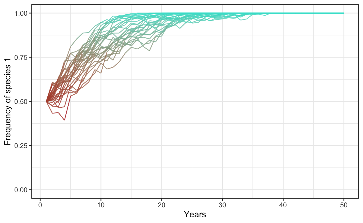
- Run the same model with 1000 individuals, 30 simulations, 50 years, and a fitness ratio of 1.2. Plot your outcomes next to your previous plot.
# selection
num.sims <- 30
num.years <- 50
freq.1.mat <- matrix(ncol = num.sims, nrow = num.years)

for (j in 1:num.sims) {
  J <- 1000
  t0.sp1 <- 0.5*J
  community <- vector(length = J)
  community[1:t0.sp1] <- 1
  community[(t0.sp1+1):J] <- 2
  year <- 2
  freq.1.mat[1,j] <- sum(community==1)/J

  for (i in 1:(J*(num.years-1))) {
    freq.1 <- sum(community==1)/J
    freq.2 <- 1 - freq.1
    fit.ratio <- 1.2
    pr.1 <- fit.ratio*freq.1/(fit.ratio*freq.1 + freq.2)
    community[ceiling(J*runif(1))] <- sample(c(1,2), 1, prob=c(pr.1,1-pr.1))

    # record data in the freq.1.mat matrix
    if (i %% J == 0) {
      freq.1.mat[year, j] <- sum(community==1)/J
      year <- year + 1
    }
  }
}

colnames(freq.1.mat) <- 1:num.sims # set column names in matrix

freq.sp1.df <- as.data.frame(freq.1.mat) %>% # convert freq.1.mat into data frame
  add_column(year = 1:num.years) %>% # add a column called year
  gather(1:30, key = iteration, value = frequency) # gather into long format

p2 <- ggplot(freq.sp1.df,
             aes(x = year,
                 y = frequency,
                 group = iteration)) +
  geom_line(aes(color = frequency),
            alpha = 0.8) +
  scale_color_gradient(low = "firebrick",
                       high = "turquoise") +
  theme_bw() +
  theme(legend.position = "none") +
  scale_y_continuous(limits = c(0,1)) +
  xlab("Years") +
  ylab("Frequency of species 1")
p2
PartII <- p1+p2
Part III
Introduce negative frequency dependence into your model. To do so, you first need to define your average fitness ratio (fit.ratio.avg) based on the prevailing selective advantage. Frequency dependence then affects the fit.ratio in the following terms: exp(freq.dep * (freq.1 - 0.5) + log(fit.ratio.avg)).
- Run a model with 300 individuals, 30 simulations, 50 years, an average fitness ratio of 1.2, and a negative frequency dependence of -0.3. Plot your outcomes.
# negative freq dep
num.sims <- 30
num.years <- 50
freq.1.mat <- matrix(ncol = num.sims, nrow = num.years)

freq.dep = -0.3
fit.ratio.avg <- 1.2

for (j in 1:num.sims) {
  J <- 300
  t0.sp1 <- 0.5*J
  community <- vector(length = J)
  community[1:t0.sp1] <- 1
  community[(t0.sp1+1):J] <- 2
  year <- 2
  freq.1.mat[1,j] <- sum(community==1)/J

  for (i in 1:(J*(num.years-1))) {
    freq.1 <- sum(community==1)/J
    freq.2 <- 1 - freq.1
    fit.ratio <- exp(freq.dep*(freq.1-0.5) + log(fit.ratio.avg))
    pr.1 <- fit.ratio*freq.1/(fit.ratio*freq.1 + freq.2)
    community[ceiling(J*runif(1))] <- sample(c(1,2), 1, prob=c(pr.1,1-pr.1))

    # record data in the freq.1.mat matrix
    if (i %% J == 0) {
      freq.1.mat[year, j] <- sum(community==1)/J
      year <- year + 1
    }
  }
}

colnames(freq.1.mat) <- 1:num.sims # set column names in matrix

freq.sp1.df <- as.data.frame(freq.1.mat) %>% # convert freq.1.mat into data frame
  add_column(year = 1:num.years) %>% # add a column called year
  gather(1:30, key = iteration, value = frequency) # gather into long format

p1 <- ggplot(freq.sp1.df,
             aes(x = year,
                 y = frequency,
                 group = iteration)) +
  geom_line(aes(color = frequency),
            alpha = 0.8) +
  scale_color_gradient(low = "cyan3",
                       high = "bisque3") +
  theme_bw() +
  theme(legend.position = "none") +
  scale_y_continuous(limits = c(0,1)) +
  xlab("Years") +
  ylab("Frequency of species 1")
p1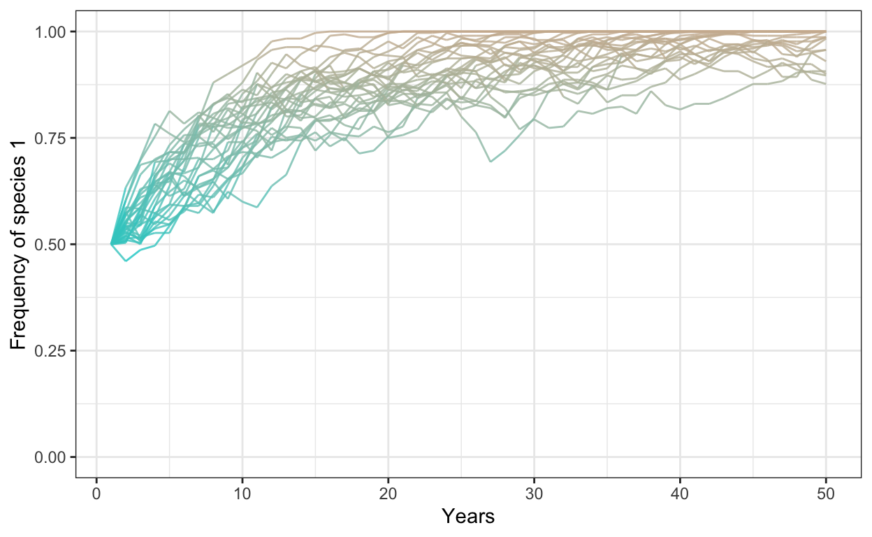
- Run a model with 1000 individuals, 30 simulations, 50 years, a fitness ratio of 1.5, and a negative frequency dependence of -0.5. Plot your outcomes.
# negative freq dep
num.sims <- 30
num.years <- 50
freq.1.mat <- matrix(ncol = num.sims, nrow = num.years)

freq.dep = -0.5
fit.ratio.avg <- 1.5

for (j in 1:num.sims) {
  J <- 1000
  t0.sp1 <- 0.5*J
  community <- vector(length = J)
  community[1:t0.sp1] <- 1
  community[(t0.sp1+1):J] <- 2
  year <- 2
  freq.1.mat[1,j] <- sum(community==1)/J

  for (i in 1:(J*(num.years-1))) {
    freq.1 <- sum(community==1)/J
    freq.2 <- 1 - freq.1
    fit.ratio <- exp(freq.dep*(freq.1-0.5) + log(fit.ratio.avg))
    pr.1 <- fit.ratio*freq.1/(fit.ratio*freq.1 + freq.2)
    community[ceiling(J*runif(1))] <- sample(c(1,2), 1, prob=c(pr.1,1-pr.1))

    # record data in the freq.1.mat matrix
    if (i %% J == 0) {
      freq.1.mat[year, j] <- sum(community==1)/J
      year <- year + 1
    }
  }
}

colnames(freq.1.mat) <- 1:num.sims # set column names in matrix

freq.sp1.df <- as.data.frame(freq.1.mat) %>% # convert freq.1.mat into data frame
  add_column(year = 1:num.years) %>% # add a column called year
  gather(1:30, key = iteration, value = frequency) # gather into long format

p1 <- ggplot(freq.sp1.df,
             aes(x = year,
                 y = frequency,
                 group = iteration)) +
  geom_line(aes(color = frequency),
            alpha = 0.8) +
  scale_color_gradient(low = "cyan3",
                       high = "bisque3") +
  theme_bw() +
  theme(legend.position = "none") +
  scale_y_continuous(limits = c(0,1)) +
  xlab("Years") +
  ylab("Frequency of species 1")
p1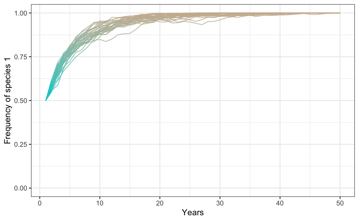
Part IV
Introduce positive frequency dependence and change your starting densities. To do so, follow the same steps as above but also adjust your initial populations.
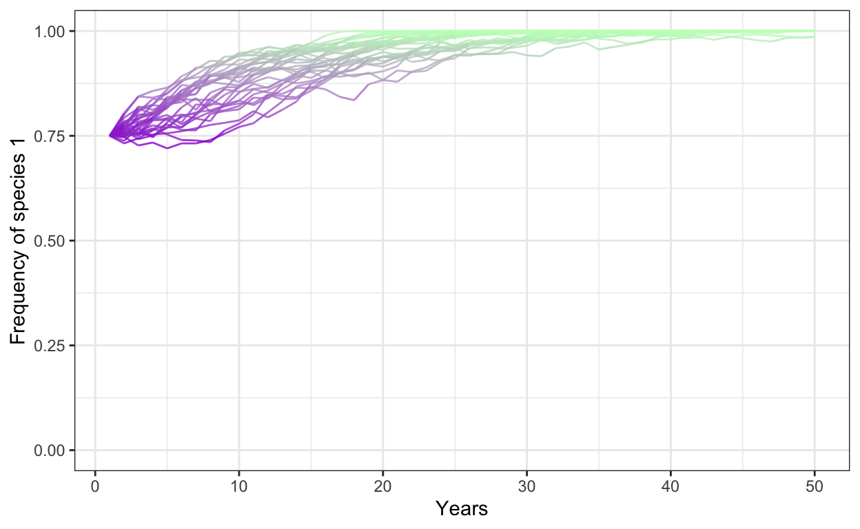
- Run a model with 1000 individuals, 30 simulations, 50 years, a fitness ratio of 1.1, and a positive frequency dependence of 0.1, with a starting frequency of Species 1 at 0.3.
# positive frequency dependence
num.sims <- 30
num.years <- 50
freq.1.mat <- matrix(ncol = num.sims, nrow = num.years)

freq.dep = 0.1
fit.ratio.avg <- 1.1

for (j in 1:num.sims) {
  J <- 1000
  t0.sp1 <- 0.3*J
  community <- vector(length = J)
  community[1:t0.sp1] <- 1
  community[(t0.sp1+1):J] <- 2
  year <- 2
  freq.1.mat[1,j] <- sum(community==1)/J

  for (i in 1:(J*(num.years-1))) {
    freq.1 <- sum(community==1)/J
    freq.2 <- 1 - freq.1
    fit.ratio <- exp(freq.dep*(freq.1-0.5) + log(fit.ratio.avg))
    pr.1 <- fit.ratio*freq.1/(fit.ratio*freq.1 + freq.2)
    community[ceiling(J*runif(1))] <- sample(c(1,2), 1, prob=c(pr.1,1-pr.1))

    # record data in the freq.1.mat matrix
    if (i %% J == 0) {
      freq.1.mat[year, j] <- sum(community==1)/J
      year <- year + 1
    }
  }
}

colnames(freq.1.mat) <- 1:num.sims # set column names in matrix

freq.sp1.df <- as.data.frame(freq.1.mat) %>% # convert freq.1.mat into data frame
  add_column(year = 1:num.years) %>% # add a column called year
  gather(1:30, key = iteration, value = frequency) # gather into long format

p1 <- ggplot(freq.sp1.df,
             aes(x = year,
                 y = frequency,
                 group = iteration)) +
  geom_line(aes(color = frequency),
            alpha = 0.8) +
  scale_color_gradient(low = "darkviolet",
                       high = "darkseagreen1") +
  theme_bw() +
  theme(legend.position = "none") +
  scale_y_continuous(limits = c(0,1)) +
  xlab("Years") +
  ylab("Frequency of species 1")
p1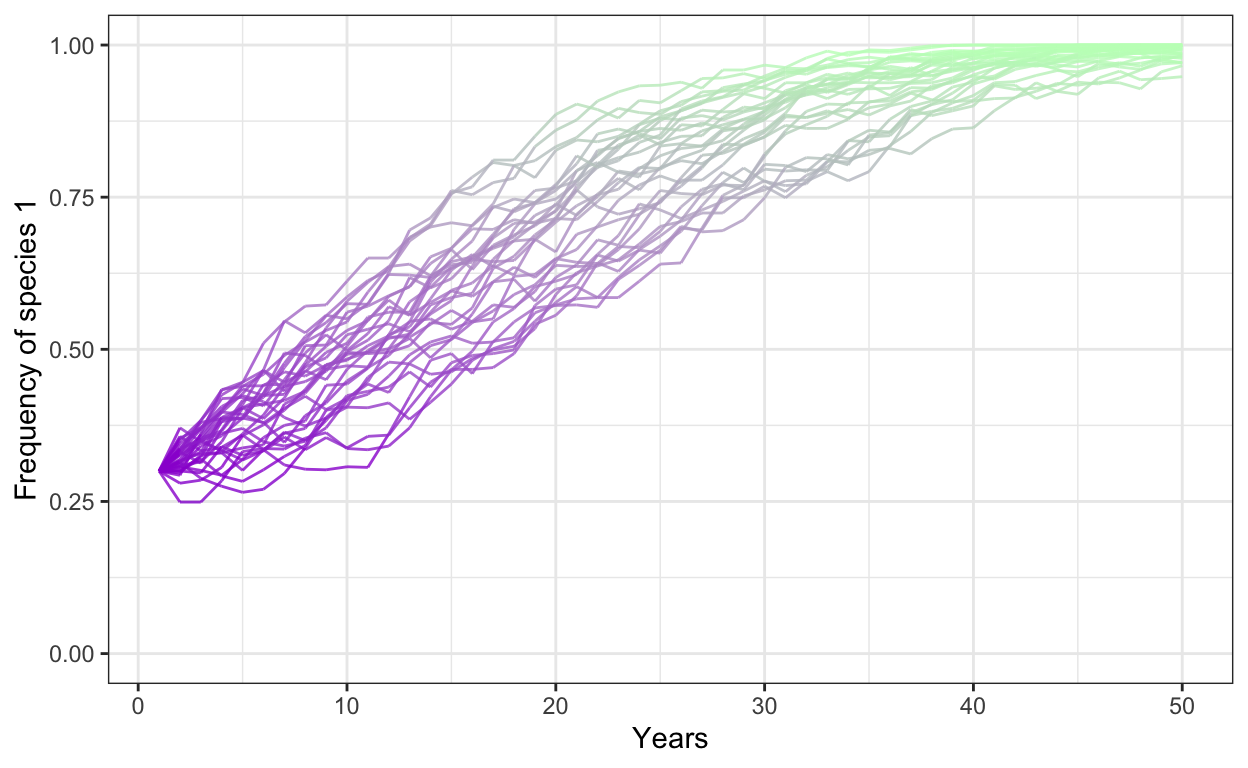
- Run a model with 1000 individuals, 30 simulations, 50 years, a fitness ratio of 1.0, a positive frequency dependence of 0.3, and a starting frequency of Species 1 at 0.75.
# positive frequency dependence
num.sims <- 30
num.years <- 50
freq.1.mat <- matrix(ncol = num.sims, nrow = num.years)

freq.dep = 0.3
fit.ratio.avg <- 1.0

for (j in 1:num.sims) {
  J <- 1000
  t0.sp1 <- 0.75*J
  community <- vector(length = J)
  community[1:t0.sp1] <- 1
  community[(t0.sp1+1):J] <- 2
  year <- 2
  freq.1.mat[1,j] <- sum(community==1)/J

  for (i in 1:(J*(num.years-1))) {
    freq.1 <- sum(community==1)/J
    freq.2 <- 1 - freq.1
    fit.ratio <- exp(freq.dep*(freq.1-0.5) + log(fit.ratio.avg))
    pr.1 <- fit.ratio*freq.1/(fit.ratio*freq.1 + freq.2)
    community[ceiling(J*runif(1))] <- sample(c(1,2), 1, prob=c(pr.1,1-pr.1))

    # record data in the freq.1.mat matrix
    if (i %% J == 0) {
      freq.1.mat[year, j] <- sum(community==1)/J
      year <- year + 1
    }
  }
}

colnames(freq.1.mat) <- 1:num.sims # set column names in matrix

freq.sp1.df <- as.data.frame(freq.1.mat) %>% # convert freq.1.mat into data frame
  add_column(year = 1:num.years) %>% # add a column called year
  gather(1:30, key = iteration, value = frequency) # gather into long format

p1 <- ggplot(freq.sp1.df,
             aes(x = year,
                 y = frequency,
                 group = iteration)) +
  geom_line(aes(color = frequency),
            alpha = 0.8) +
  scale_color_gradient(low = "darkviolet",
                       high = "darkseagreen1") +
  theme_bw() +
  theme(legend.position = "none") +
  scale_y_continuous(limits = c(0,1)) +
  xlab("Years") +
  ylab("Frequency of species 1")
p1